Some props came from a prop house, such as this (Styrofoam) Easter Island stone head. Other props – like those in centerpieces – were pulled from the homes of parents.
I recently showed a few photos from this 2009 auction to a client who was going to be doing something similar. The memory of that event still impresses me, so I thought I’d post a few of the photos on the blog.
++++++++++++++
When the Development Director told me that the school auction committee had settled on a “Night at the Museum” theme, I wasn’t overly enthusiastic. Many times I’ll have some ideas on how to support the theme. For this one, I was a tad stumped.

The Newseum (Washington, D.C.) centerpiece props were clever.
I loved the two Ben Stiller movies of the same name, but I wasn’t immediately able to scale the over-the-top special effects from the movie down to what would be realistic for the school gym.
I kept imagining Larry (the Ben Stiller character) playing fetch with the dinosaur skeleton and thinking, “Are those skeletons affordable to rent?”
With my doubts still intact, I was bowled over when I walked into the silent auction space. The auction team had brought the theme to life.
Here are some of the details that made a difference.
1. Lighting

Lighting gave the ballroom/gym ambiance.
Lighting made a strong impression at this event. Because museums rely so heavily on lighting to showcase displays and exhibits, the addition of museum-type lighting in the gym helped seal-the-deal. It significantly contributed to making the space feel more like a museum.
2. General Decor
To get to the gymnasium, guests walked in through the front of the school, walked down a long hallway filled with lockers, down some stairs, through another hallway, and into the gym.
To set the mood, “artifacts” were set up throughout the hallway. Old school uniforms and photographs from the early days of the school were stationed throughout the area. (Incidentally, this concept would also work well for a “Generation to Generation” auction theme.)
3. Centerpieces
Each centerpiece was different and showcased a different museum from around the USA. Parents scrimmaged around in closets to find appropriate props to create the roughly 30 centerpieces needed for the auction.
4. Signage
The signage on the tables, on the easels, and on the walls all had that certain elegance you’d expect to see at a museum.
5. Displays for the Live Auction Items

Live auction displays in frames on the wall were classic museum-esque.
The school made displays for each live auction item. To create a more upscale look, they were put in over-sized frames and hung on a wall with a black drape. Lights showcased each one so it was easy to read the description.
Most of the items also had a small table or prop in front of the display to showcase it.
- The bar was in the middle of the silent auction space and had a prop to appear “museum-like.”
- Placards of famous women adorned the wall.
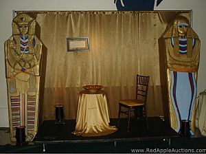
- A decor vignette
- Lighting was used extensively to enhance the theme. In this shot, canned lights uplight a backdrop.
- Even the plantstands carried a museum vibe
- School auction catalog cover
 ++++++++++++
If you are the Decor Chair responsible for coming up with a school auction theme, here’s a resource designed just for you!
This DVD and workbook (see photo) simplifies common themes and trending ones. Each concept is supported by many photos.
Take a peek at School Auction Themes, Centerpieces, and Decor.
A nice tie-in or separate product would be this collection of school auction catalogs.


Leave a Reply